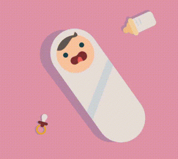
What is micro animation?
When you open a website or a mobile app, your eyes usually catch the big visuals or bold headlines first. But what really makes the experience feel smooth, alive, and somehow emotional are often the tiniest details. These are what we call micro animations.
In a way, micro animations are little gestures that quietly say to the user, “I’m here, and I understand you.” A button that slightly vibrates when you tap it, an icon that spins while loading, or a card that subtly enlarges when you hover over it — these are all tiny movements that make the interface feel more intuitive, more human.
Where Did Micro Animations Come From?
The rise of micro animations is a result of both technology evolving and design thinking maturing. In the past, websites were static, and adding any sort of movement often required heavy tools like Flash. But with the spread of mobile devices, users started expecting more interactive and responsive interfaces. Designers had to find new ways to do more with less — and that’s when micro animations began to shine.
When Google introduced Material Design in 2014, these tiny motions became part of a formal design language. Micro animations were no longer just decorative — they became tools for guiding users, showing transitions, and creating clarity. Since then, almost every digital product “speaks” this language in one way or another.
Design Process
Designing a micro animation is kind of like writing a tiny story. You start by deciding what you want to communicate. For example, the user has submitted a form. Instead of just saying “done,” you can express it more effectively with a soft animation — like a checkmark gently appearing and fading away.
That’s where it begins. Then you pick the right tools. Designers often use Figma, Adobe After Effects, Lottie, or Principle to create prototypes. On the development side, you’ll see technologies like CSS animations, JavaScript, React Spring, or Framer Motion bringing them to life. In mobile apps, platforms like SwiftUI for iOS and MotionLayout for Android are common choices.
But here’s the trick: these animations should never annoy the user. In fact, the best ones are felt, not noticed. Too slow? It drags. Too fast? It loses meaning. And most importantly, every animation should have a clear purpose. Those added “just to look cool” usually end up harming the experience more than helping it.
Small, but Powerful!
Sometimes, instead of saying a whole sentence, just a wink is enough. Micro animations are the design equivalent of that wink. With a simple move, they say: “Yep, I saw that, it’s done.” Or, “Hey, look over here.”
Personally, these little moments are my favorite part of the design process — the final touches that make everything click. Because that’s when I know the user will feel comfortable, maybe even without knowing why. And that’s one of the most human things that can happen in a digital world.
Image credit: https://medium.com/@zeuxinnovation/micro-animation-good-things-come-in-small-packages-30915042a8f4

Yorum yok